12 parent interviews across 4 cities
Parents were not price-sensitive so much as trust-sensitive. The question behind every hesitation was 'what happens to my child's admission if this fails?'
A monthly fee-financing flow for parents who abandon the moment a form feels like a loan application.
Outcomes
2M+
parents reachable
−41%
drop-off at KYC
3 steps
down from 7
Context
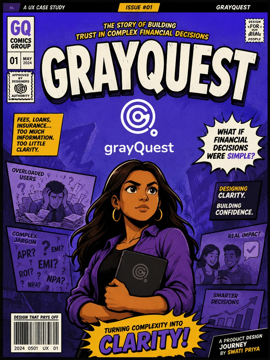
GrayQuest lets parents pay school fees monthly instead of in one lump sum. The product is financially regulated, so the flow carries KYC, credit checks and repayment consent — three things parents never asked for and rarely understand.
The existing journey read like a loan application: seven screens, bank vocabulary, no visible progress, and errors that appeared only after submitting. Most parents who dropped off never came back.
The problem
Parents dropped off at KYC and repayment-plan selection: too many unexplained steps, no sense of what they had already cleared, and jargon that read like a bank contract.
Research
Parents were not price-sensitive so much as trust-sensitive. The question behind every hesitation was 'what happens to my child's admission if this fails?'
Two-thirds of abandonment sat in KYC document upload and plan selection. Replays showed repeated pinch-zooming on plan tables and multiple retries on the same upload field.
Tickets grouped into three themes: 'is my payment received', 'which document counts', and 'what is the total I actually pay'.
Process
Wrote the flow as sentences before drawing screens, marking which steps were legally required, which were internal preference, and which could be deferred until after the first payment.
Grouped required inputs into Identity, Plan and Confirm. Anything optional moved into a post-approval profile nudge, cutting the pre-commitment ask by half.
Replaced 'tenure', 'principal outstanding' and 'processing fee' with plain phrasing and a single 'you pay in total' figure that never changed position on the screen.
Tested the upload step with parents using their own Aadhaar and fee receipts on their own phones — which surfaced glare, crop and file-size failures a clean prototype hides.
Key decisions
Instead of 'Step 2 of 7', the flow says what is left. Fewer remaining items reads as relief; a long total reads as work.
Credit and document checks return as-you-go states so a rejection never lands as a surprise on the final screen.
The confirmation doubles as a shareable proof of payment for the school, because that was the parent's real end goal.
Reflection
In regulated flows, the design work is mostly deciding what can be asked later.
Comparison tables are a desktop artefact — parents compared plans best as stacked cards with one differing line highlighted.
Trust came from visible status, not reassuring copy.
Keep reading